Morning Brew is for pages that feel like a quiet table by the window: coffee cooling in a ceramic cup, cream paper, warm wood, a little green from the plant on the sill. It is not a loud theme. It works best when the colors stay grounded and tactile.
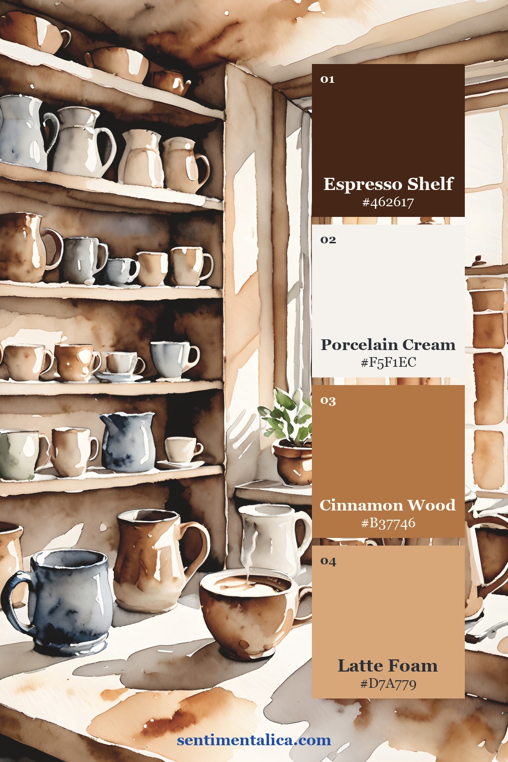
Start with espresso and cream
The easiest way to use this palette is to let espresso brown act as the anchor and porcelain cream act as the breathing space. Put the darkest color in one strong place: a tab, a title strip, a pocket edge, or a tiny label. Then let the cream papers carry the quiet.
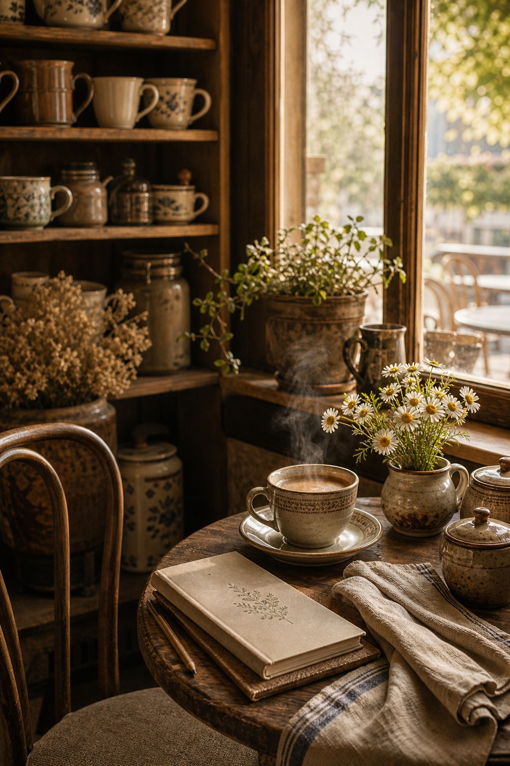
Add one botanical note
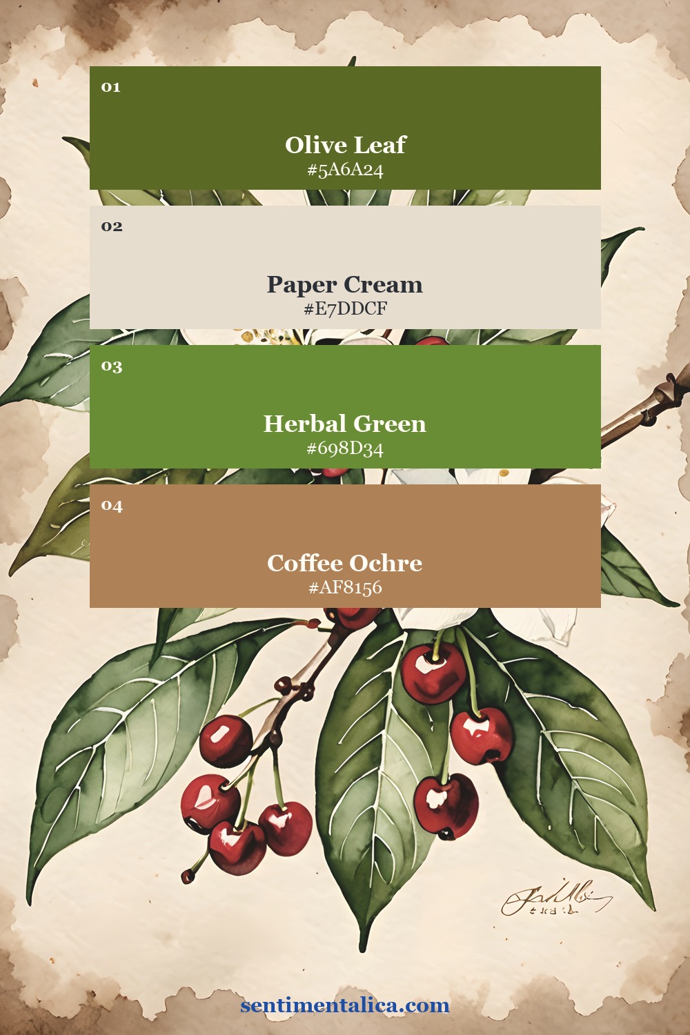
Coffee palettes can become too brown if every scrap is warm. A little olive, herbal green, or leaf shadow keeps the page alive. Use it once as a botanical accent, once as a torn paper layer, and then stop. That small green detail is what makes the page feel like morning rather than sepia.
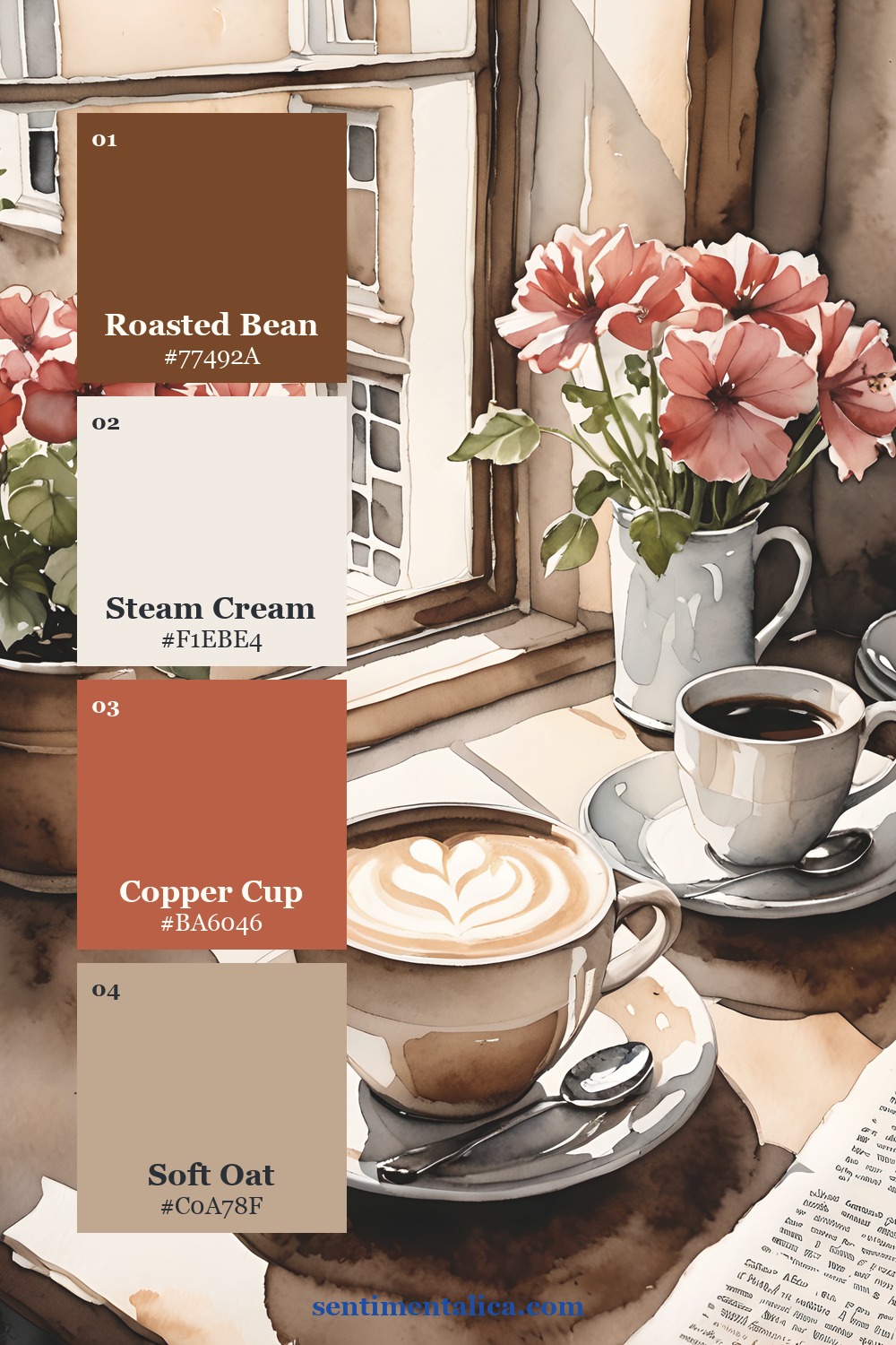
Choose a softer cup color
Copper, oat, latte foam, and cinnamon wood are the middle colors. They bridge the dark coffee shade and the cream page. If you want a softer spread, use the pale oat color around the photo or note. If you want a richer spread, pull in copper cup or cinnamon wood.
See the printable pages up close

If you want a page that already has the cozy coffee-shop mood built in, use Morning Brew as the base and add your own receipt corner, tea tag, recipe note, or tiny breakfast memory on top.
Browse more Sentimentalica journal ideas.